2020 - 2015

SBB2020 - 2022
SBB2020 - 2022
AirFrance-KLM 2020
AirFrance-KLM 2020
Rabobank2017 - 2019
Rabobank2017 - 2019
P&G - Valtech2019 - 2020
CASETemplate
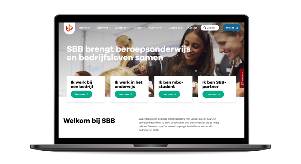
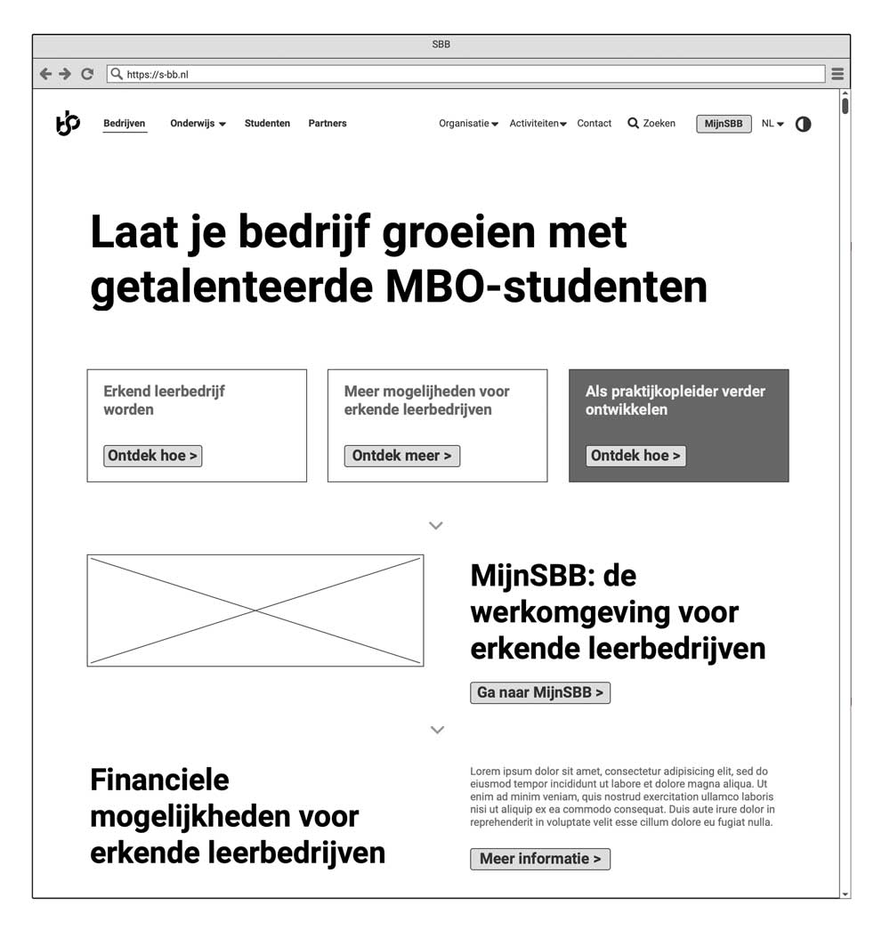
As a member of the SBB core team and together with an external design agency, I worked on the complete re-design of s-bb.nl. (Go-live was in September 2021).
My activities entailed: concept mapping, concept design, UX architecture, UX design, concept testing and design coordination and planning.
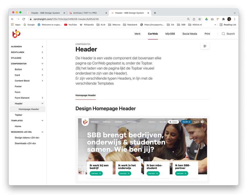
In parallel, the website project was used to initiate the development of the SBB design system.
Together with 2 UX colleagues we started with setting up the framework in Figma and Zeroheight; together with a roadmap for defining the components and guidelines. The 'filling' of the design system started right after sbb.nl went live.
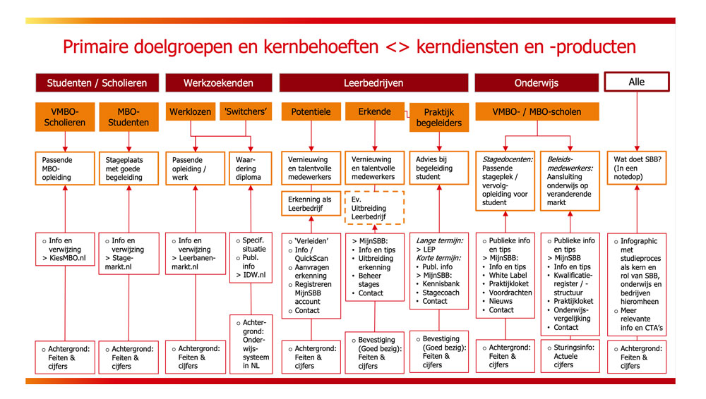
SBB is in the process of further digitalization and, related to this, further developing their IT processes and organization.
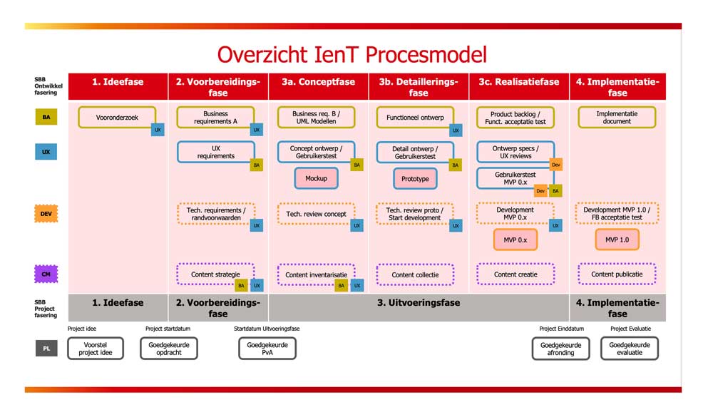
The UX team joined forces with the Business Analysts team and worked on the so-called 'SBB Process Model' to align the activities of Business Analysts, Designers and Developers within the existing project management process framework. The SBB Process Model is still evolving and is currently rolled out step-by-step in the organization.
As a member of the SBB core team and together with an external design agency, I worked on the complete re-design of s-bb.nl. (Go-live was in September 2021).
My activities entailed: concept mapping, concept design, UX architecture, UX design, concept testing and design coordination and planning.
In parallel, the website project was used to initiate the development of the SBB design system.
Together with 2 UX colleagues we started with setting up the framework in Figma and Zeroheight; together with a roadmap for defining the components and guidelines. The 'filling' of the design system started right after sbb.nl went live.
SBB is in the process of further digitalization and, related to this, further developing their IT processes and organization.
The UX team joined forces with the Business Analysts team and worked on the so-called 'SBB Process Model' to align the activities of Business Analysts, Designers and Developers within the existing project management process framework. The SBB Process Model is still evolving and is currently rolled out step-by-step in the organization.
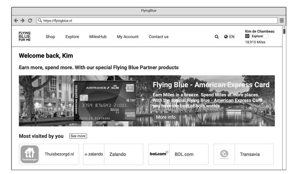
A strategic goal for AirFrance-KLM is to make its Flying Blue loyalty program more attractive by offering more 'Pay' products by which customers can earn and spend miles.
My assignment was to set up a concise UX strategy and concept direction from a customer perspective. The results have played a contributory role in obtaining the overall budget for further development and implementation in 2021 and the preliminary ramp-up in 2020.
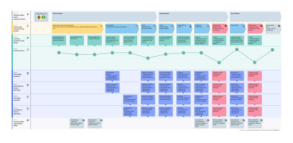
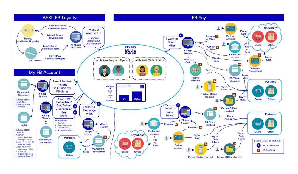
The set of 'Pay' products was divided into 'Spend' and 'Earn' products and for each group, I set up more detailed Customer Journeys to clarify which UX features, from customer perspective, would be needed to design and develop the products in a user-centered way.
This was the core part of my assignment, as in the preliminary phases of the project the products were primarily set up and conceptualized from a business and technical perspective.
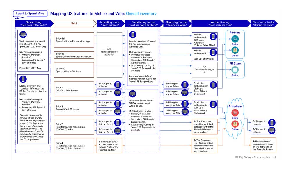
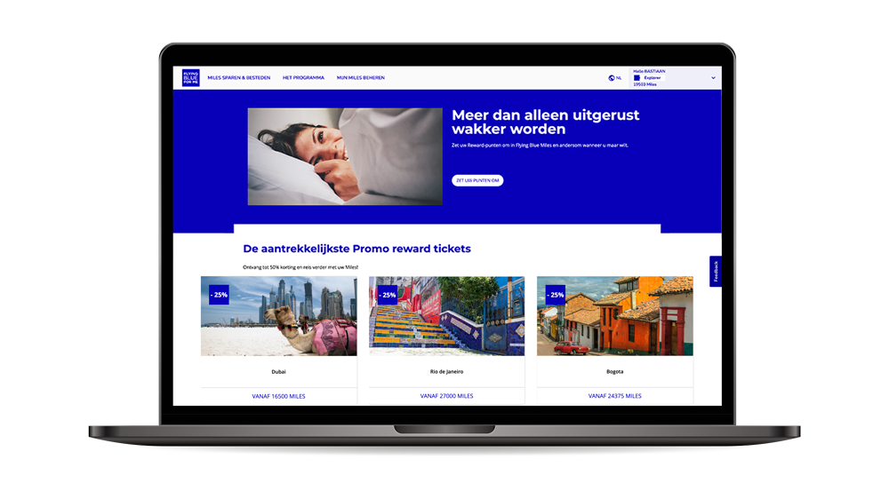
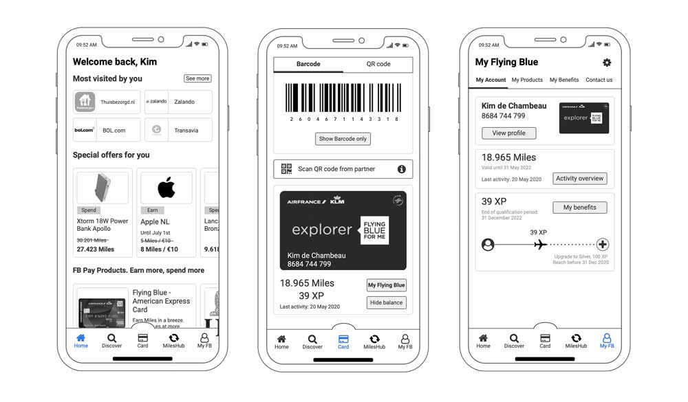
To make the UX strategy more tangible and concrete for stakeholders, I created clickable mock-ups for mobile and web.
The mockups modeled a limited set of key user scenarios and have laid down a concept direction to be used as input for the future design and development team.
(Note: In the meantime, the first MVP has been launched in May 2021)
A strategic goal for AirFrance-KLM is to make its Flying Blue loyalty program more attractive by offering more 'Pay' products by which customers can earn and spend miles.
My assignment was to set up a concise UX strategy and concept direction from a customer perspective. The results have played a contributory role in obtaining the overall budget for further development and implementation in 2021 and the preliminary ramp-up in 2020.
The set of 'Pay' products was divided in 'Spend' and 'Earn' products and for each group, I set up more detailed Customer Journeys to clarify which UX features, from customer perspective, would be needed to design and develop the products in a user-centered way.
This was the core part of my assignment, as in the preliminary phases of the project the products were primarily set up and conceptualized from a business and technical perspective.
— Flying Blue UX features map
To make the UX strategy more tangible and concrete for stakeholders, I created clickable mock-ups for mobile and web.
The mockups modelled a limited set of key user scenarios and have laid down a concept direction to be used as input for the future design and development team.
(Note: In the meantime the first MVP has been launched in May 2021)
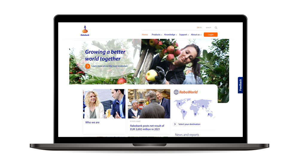
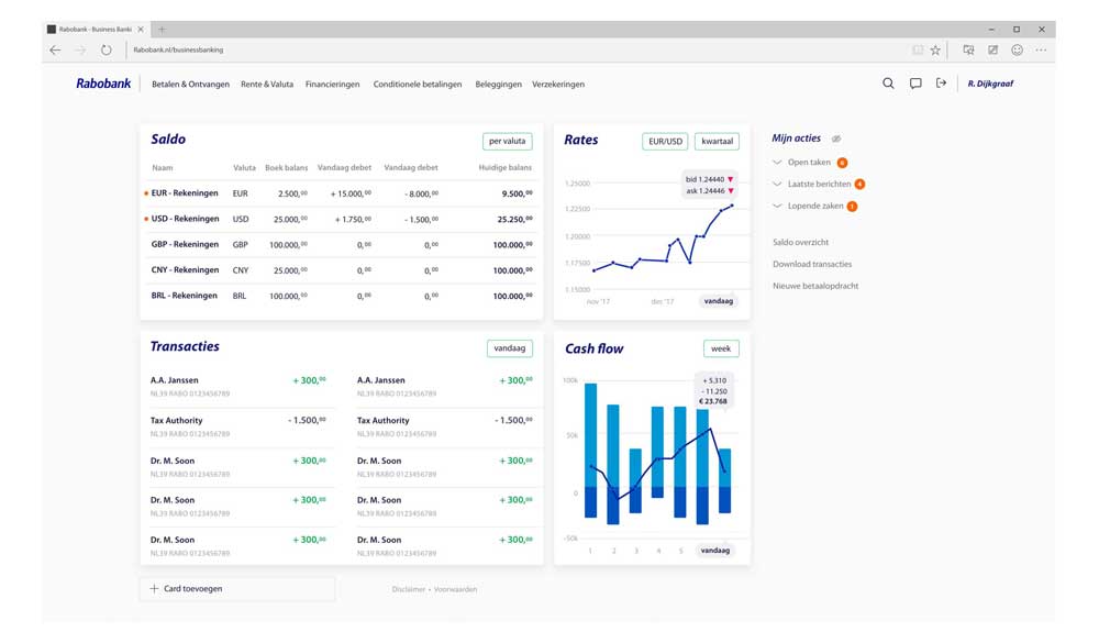
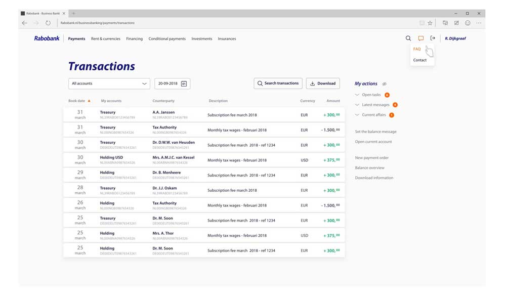
Concept design and UX roadmap for an integrated platform for business customers that eventually has to replace the current palette of many different platforms.
The initial analysis and concept phase were led by the UX team. After this first phase, the UX framework and functionalities were further developed in an agile squad team, with the first MVP going live in Q3 2019.
In 2018 Rabobank was in the midst of an organizational change in which digital services development together with UX design became key activities. The whole Rabobank UX team was very active in promoting and embedding the end-to-end user-centered design process into the development process.
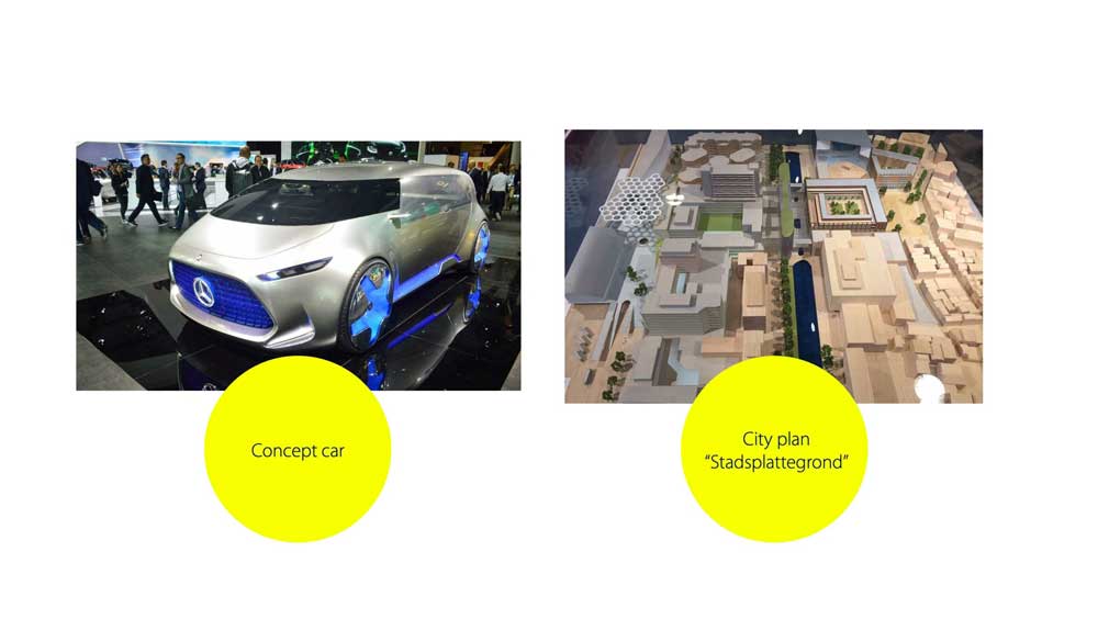
I contributed in the area of design strategy and road mapping and was delighted to see my initial idea of a 'concept car' / design-led approach becoming popular in the teams working on the consumer Rabobank app.
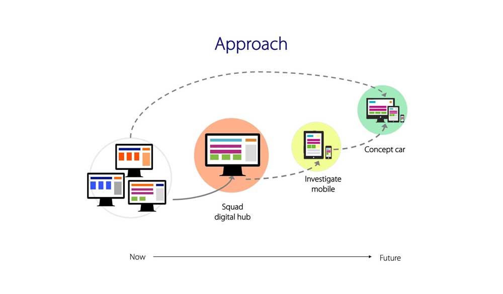
However, when working on an entire platform for future Business Banking, the 'concept car' metaphor fell short. For Business Banking I expanded the idea towards a 'city planning' metaphor, in which city architects lay down a basic structure for an area in terms of functions, infrastructure and experience. After this phase, building architects and contractors are invited and commissioned to 'fill in the details'.
Following this metaphor, the Rabobank Business Banking squad has also laid down the overall UX framework after which specific business and development squads could integrate their digital service or feature into the framework.
Q4 2017 - Q2 2019 (1,5 years)
Concept design and UX roadmap for an integrated platform for business customers that eventually has to replace the current palette of many different platforms.
The initial analysis and concept phase were led by the UX team. After this first phase, the UX framework and functionalities were further developed in an agile squad team, with the first MVP going live in Q3 2019.
In 2018 Rabobank was in the midst of an organizational change in which digital services development together with UX design became key activities. The whole Rabobank UX team was very active in promoting and embedding the end-to-end user-centered design process into the development process.
I contributed in the area of design strategy and road mapping and was delighted to see my initial idea of a 'concept car' / design-led approach becoming popular in the teams working on the consumer Rabobank app.
However, when working on an entire platform for future Business Banking, the 'concept car' metaphor fell short. For Business Banking I expanded the idea towards a 'city planning' metaphor, in which city architects lay down a basic structure for an area in terms of functions, infrastructure and experience. After this phase, building architects and contractors are invited and commissioned to 'fill in the details'.
Following this metaphor, the Rabobank Business Banking squad has also laid down the overall UX framework after which specific business and development squads could integrate their digital service or feature into the framework.
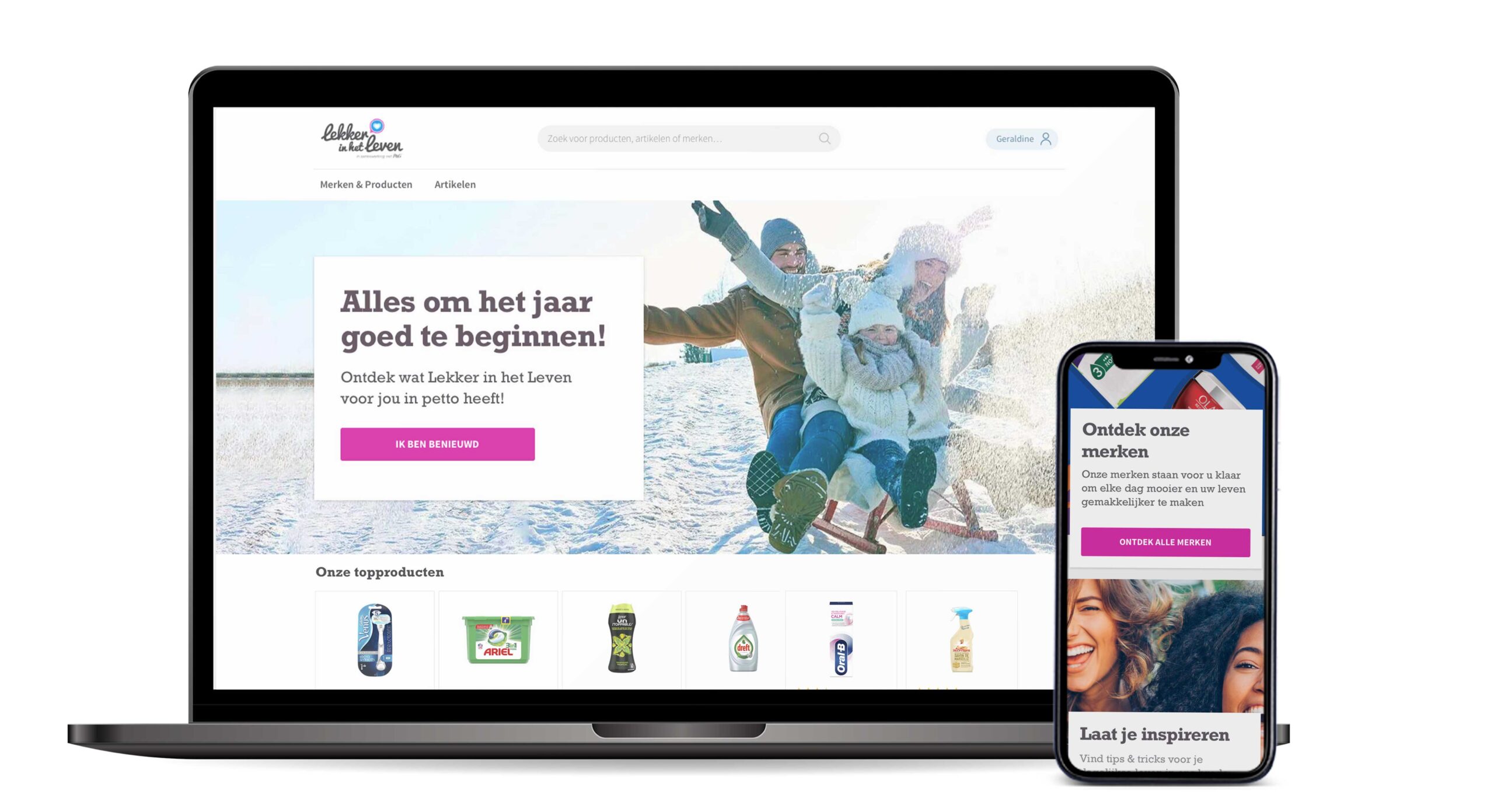
Procter & Gamble has set up online consumer communities around their brands in several countries across the globe.
The community websites offer many articles with advice and tips for areas in life like health, home, family and beauty. These articles may or may not contain product promotions, and if so, the promotions are always in context of the content.
Next to the articles, members can find product reviews, competitions, free samples, etc.
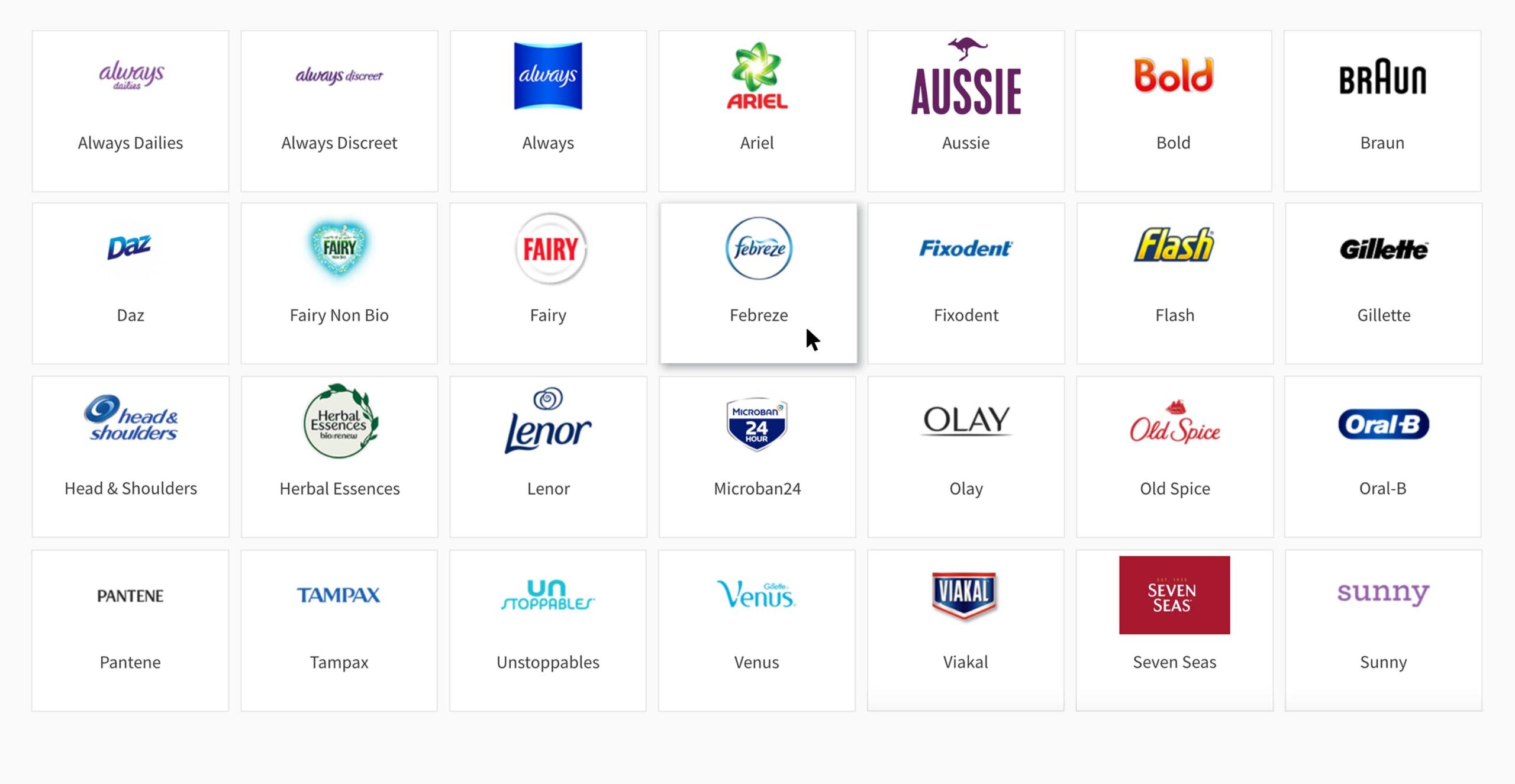
The communities are strongly localized and carry different names per country.
For example:
Globally, the community websites are built on the same platform and in 2019 there was a strong requirement to migrate to a new platform. P&G also decided to combine this with a concise redesign focusing on improving the experience.
Valtech was commissioned to manage and carry out the re-platforming project. The first MVP, for the German market, was scheduled for Q4 2020.
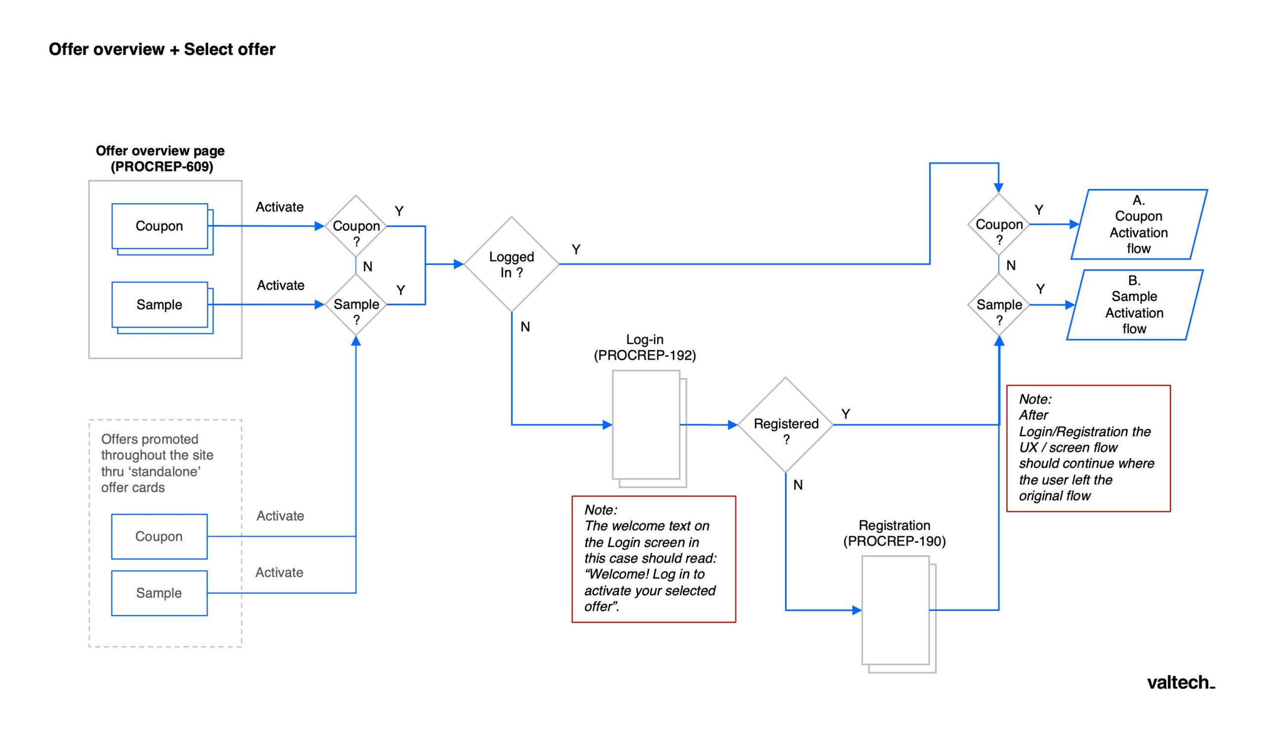
In close cooperation with a visual designer from Valtech, I have worked on wireframes, flows, mockups, and hi-fi prototypes.
We have also worked jointly on applying the accessibility guidelines and supplying assets and specs to front-end development.
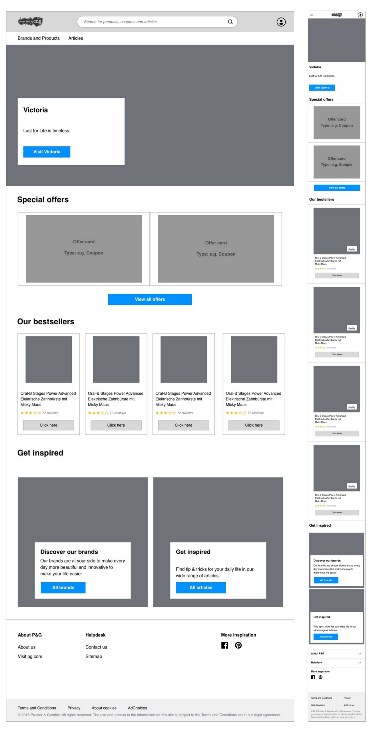
The site offers many interactive features like submitting product reviews, entering competitions, requesting free samples, etc.
Careful attention was given to designing the user flows as clear and easy as possible within the challenging technical constraints.
Procter & Gamble has set up online consumer communities around their brands in several countries across the globe.
The community websites offer many articles with advice and tips for areas in life like health, home, family and beauty. These articles may or may not contain product promotions, and if so, the promotions are always in context of the content.
Next to the articles, members can find product reviews, competitions, free samples, etc.
The communities are strongly localized and carry different names per country.
For example:
Globally, the community websites are built on the same platform and in 2019 there was a strong requirement to migrate to a new platform. P&G also decided to combine this with a concise redesign focusing on improving the experience.
Valtech was commissioned to manage and carry out the re-platforming project. The first MVP, for the German market, was scheduled for Q4 2020.
In close cooperation with a visual designer from Valtech, I have worked on wireframes, flows, mockups, and hi-fi prototypes.
We have also worked jointly on applying the accessibility guidelines and supplying assets and specs to front-end development.
The site offers many interactive features like submitting product reviews, entering competitions, requesting free samples, etc.
Careful attention was given to designing the user flows as clear and easy as possible within the challenging technical constraints.